How to build an activity dashboard with ResearchKit
Participants’ commitment is crucial for medical studies, and one of the best ways to keep people interested in a ResearchKit app is to offer a great dashboard.
This component usually provides some immediate feedback on the latest activities performed by the participant. But it also offers a long-term view of these results, to assess the evolution of his or her condition. It can be particularly interesting for apps targeting chronic diseases, for instance.
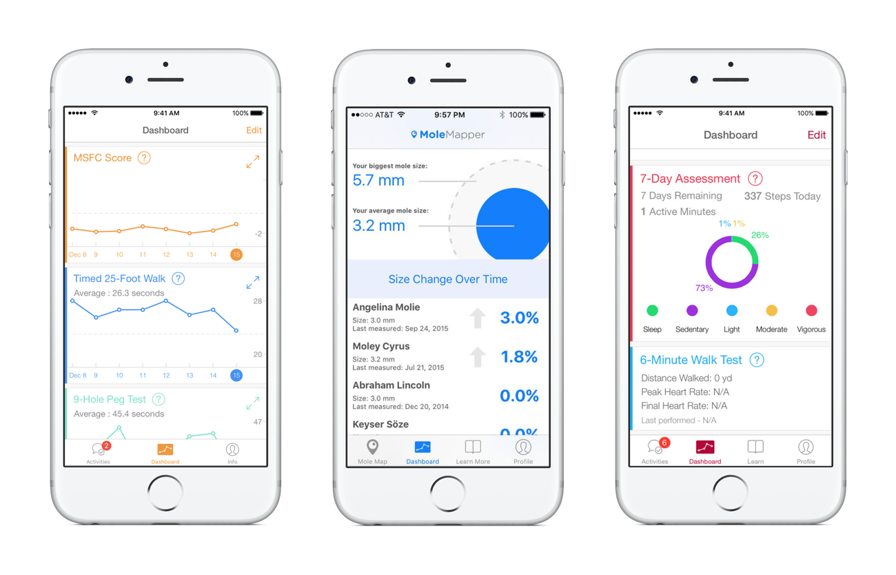
Examples of ResearchKit apps dashboards (Neurons, Mole Mapper, MyHeart Counts)
As we will discuss in this article, the dashboard controller itself isn’t directly available as a ResearchKit component. So we will have to build it ourselves, based on standard iOS classes and the configurable charts and graphs provided by ResearchKit.
Dashboard view controller
The typical ResearchKit dashboard is a vertical list of elements, and for iOS, that means a UITableViewController. This controller manages a UITableView, which we will configure with a “row” for each chart or graph.
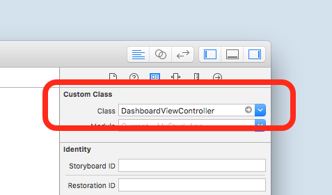
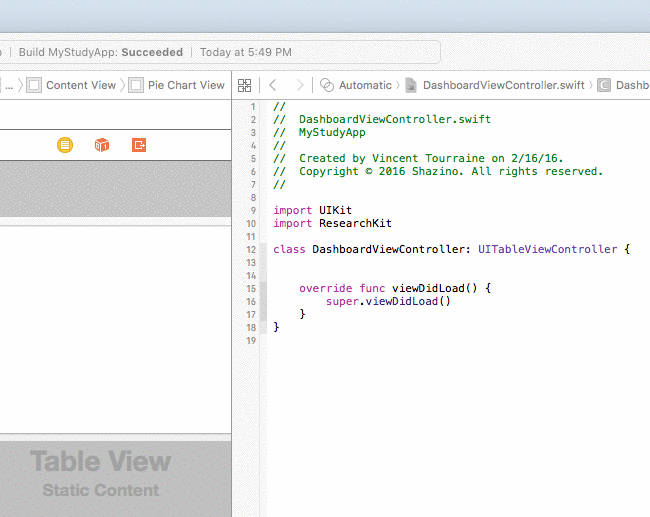
So first, we create a new “UITableViewController” subclass named “DashboardViewController”. Then we drag-and-drop a new “Table View Controller” object into our main Storyboard, and configure it with our newly created custom class.
Next, we embed this controller inside a “UINavigationController” (“Editor” → “Embed In” → “Navigation Controller”). Finally, we add this navigation controller to the existing tab bar controller: we ctrl-drag from the tab bar controller to the dashboard navigation controller, and select “Relationship Segue: view controllers” from the popup menu to include it as a new tab. It’s easy to give a title to our view controller from the Interface Builder, and also configure the “bar item” with a title and an image.
You can build and run the app, and you should see our new “Dashboard” tab. It’s currently empty, of course, so now we can start configuring its content with charts and graphs.
Graphs and charts
ResearchKit provides 3 basic types of charts and graphs.
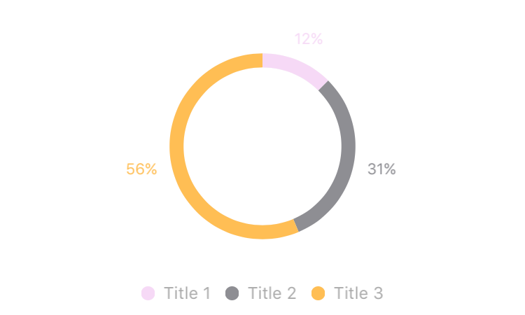
Pie Charts
ORKPieChartView (documentation)
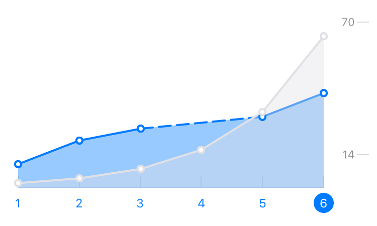
Line Graph Chart
ORKLineGraphChartView (documentation)
Discrete Graph Chart
ORKDiscreteGraphChartView (documentation)
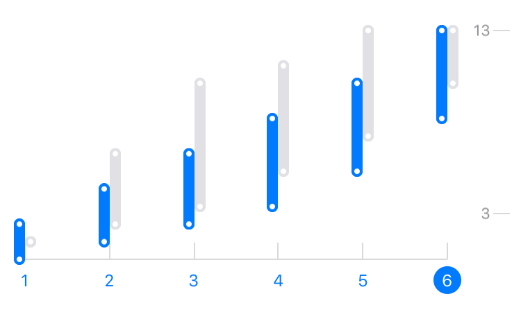
For the discrete and line graph charts, you can actually display multiple lines or multiple points, to compare different datasets on the same graph. As you can expect, these classes are very flexible (customizable colors, labels, dimensions, etc), and should cover most of the usual needs.
See also: ResearchKit Programming Guide — Charts and Graphs
The easiest way to include these views inside our view controller is to setup the Storyboard with “static” cells. It means that the table view will always display the same cells, in the same order (the alternative would be to use “dynamic” cells, for more complex layouts).
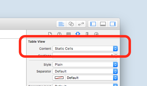
Once we have configured our table view as “static”, we drag-and-drop our first cell. Then, we configure its content view by adding a subview, for which we will specify a custom class with one of the 3 chart view classes. Let’s start with ORKPieChartView. In the Interface Builder window, this view appears completely empty. It will only come alive once the app runs on the device or simulator.
Before we move on to provide the actual chart data, we need to reference this view from our dashboard controller class. Switch to the Xcode “Assistant” mode, to get the Storyboard and the view controller code editor side-by-side, then ctrl-drag from the chart view, and drop it inside your class to setup an “IBOutlet” and give it a name.
You can use this new property to customize the chart appearance, for instance from the viewDidLoad() method:
  1
2
3
4
5
6

  override fun viewDidLoad() {
  super.viewDidLoad()

  pieChartView.titleColor = UIColor.orangeColor()
  pieChartView.showsTitleAboveChart = true
}
Data source
Last but not least, we need to provide the chart data. These 3 ResearchKit graphs and charts classes rely on a “data source” protocol. This code pattern separates the view (the form) and the code responsible for the data (the substance).
The pie charts data source conforms to ORKPieChartViewDataSource (documentation), while both types of graphs (line and discrete) data sources conform to ORKGraphChartViewDataSource (documentation).
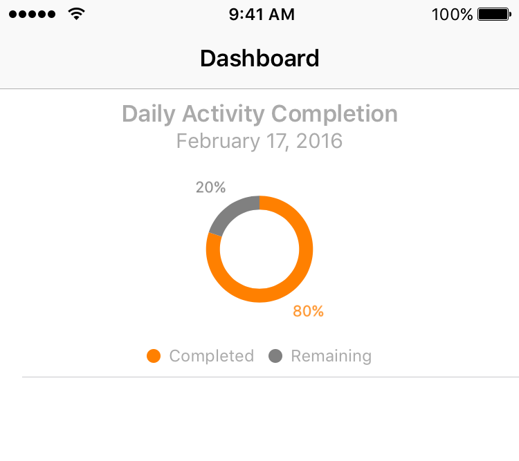
As an example, we are going to implement a pie chart that displays how many of the participant’s daily activities have been completed. That’s actually a common dashboard item in existing ResearchKit apps.
For simplicity’s sake, we will directly use our view controller as the data source of our chart. For more complex apps, we would recommend adding dedicated classes, with instances created by the view controller, to fill that role.
So first, let’s modify the controller declaration to indicate that it conforms to the data source protocol.
class DashboardViewController: UITableViewController, ORKPieChartViewDataSource {
Then, specify the view controller as the data source for our pie chart. We usually perform this kind of configuration from the controller viewDidLoad() method:
  1
2
3
4
5
6

  override func viewDidLoad() {
  super.viewDidLoad()
  // ...

  pieChartView.dataSource = self
}
The data source protocols define both required and optional methods. For pie charts, the ORKPieChartViewDataSource protocol expects a number of segments, as well as a value for each segment. We want to display the percentage of completed activities, so that’s just 2 segments: the completed and the remaining values.
The completion value will be saved as a percentage with a stored property (computing this value depends on your app data management, which goes beyond the scope of this article), and we will define a segment enumeration to make our code more readable:
  1
2
3
4
5
6
7
8
9
10
11
12
13
14
15
16
17
18
19
20
21
22
23

  var activityCompletionPercentage: CGFloat = 0

enum PieChartSegment: Int {
  case Completed, Remaining
}

func numberOfSegmentsInPieChartView(
  pieChartView: ORKPieChartView) -> Int {

    return 2
}

func pieChartView(
  pieChartView: ORKPieChartView,
  valueForSegmentAtIndex index: Int) -> CGFloat {

    switch PieChartSegment(rawValue: index)! {
    case .Completed:
      return activityCompletionPercentage
    case .Remaining:
      return 100 - activityCompletionPercentage
    }
}
This data source implementation fills all the protocol requirements, so we can build and run the app to see the result.
Configuration
It’s easy to add a couple of optional methods, and customize the pie chart view to make it look more engaging. For instance, let’s use a bright color for the “completed” segment, and a light gray for the “remaining” segment. We can also add titles to better express the meaning of this chart.
  1
2
3
4
5
6
7
8
9
10
11
12
13
14
15
16
17
18
19
20
21
22
23

  func pieChartView(
  pieChartView: ORKPieChartView,
  colorForSegmentAtIndex index: Int) -> UIColor {

    switch PieChartSegment(rawValue: index)! {
    case .Completed:
      return UIColor.orangeColor()
    case .Remaining:
      return UIColor.lightGrayColor()
    }
}

func pieChartView(
  pieChartView: ORKPieChartView,
  titleForSegmentAtIndex index: Int) -> String {

    switch PieChartSegment(rawValue: index)! {
    case .Completed:
      return NSLocalizedString("Completed", comment: "")
    case .Remaining:
      return NSLocalizedString("Remaining", comment: "")
    }
}
Let’s also configure a general title and a description text with the current date from the viewDidLoad() method:
  1
2
3
4
5
6
7
8
9
10
11

  override func viewDidLoad() {
  super.viewDidLoad()
  // ...

  pieChartView.title = NSLocalizedString(“Daily Activity Completion”, comment: “”)
  pieChartView.showsTitleAboveChart = true

  let dateFormatter = NSDateFormatter()
  dateFormatter.dateStyle = .LongStyle
  pieChartView.text  = dateFormatter.stringFromDate(NSDate())
}
And this is what our dashboard looks like: a nice-looking completion chart, built entirely with ResearchKit visualization classes:
Sample code: the source code for this dashboard view controller is available on GitHub.
This process can be reused for any number of rows, and with any combination of graphs and charts. If your app needs a more complex dashboard, you can adapt this controller with dynamic rows and custom views.
 Share on Facebook
 Share on Twitter